You’re driving through town and little do you know, you just passed some of the most well-recognized brands in the world. They’ve played a major role in most people’s lives and have spread to countries on almost every continent. I’m talking about popular restaurants and the logos that accompany them.
No matter where you go, you’re sure to find a number of these logos popping up that work to remind you of the great meals you’ve had at their establishments in hopes of bringing you in for some indulging. In fact, these logos are so common and widespread, that you most likely don’t even notice them when you leave your house every day (they’re much more noticeable during lunch time).
Well, I do notice them, to the extent that I’m willing to research and list some of the most-recognized restaurant logos for you as well as explain the reasoning behind why the logos are so effective. Also if you want to go more in-depth on the topic of restaurant logos and what makes them great, then make sure to read our blog “What makes a Good Restaurant Logo Design?”. It gives a great step-by-step guide of how great restaurant logos came to be.
1. McDonald’s
You already knew this one was coming.
You can’t have a conversation about the most well-recognized restaurant logos without bringing up the famous golden arches. In fact, there are over 34,480 McDonald’s restaurants in 119 countries as of now. Not only is it one of the most popular brands on the planet but there is actually an interesting story revolving around the logo for McDonald’s, from its inception to the superpower that it is now.
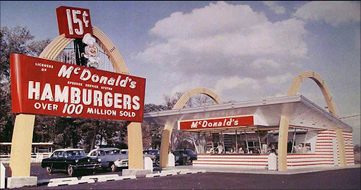
The Golden Arches were originally made back in 1952 when the founders, brothers Richard and Maurice McDonald, were in the midst of designing & building their restaurant in San Bernardino, California and wanted a design that would be eye-catching and create greater efficiency for their store. The idea of an arch arose whilst thinking of ideas and they brought it to an architect who then made it into two 25 foot yellow sheet metal arches that were trimmed in neon and included a small mascot named “Speedee” that was included in the logo, an example of which is shown below.
Then in 1962, McDonald’s began to search for a new logo to keep up with the times and to move on from their previous that was seen as more old-fashioned. That’s when they thought to change the arch into an “M” that is widely seen all over the world today.
2. Starbucks
The most well-known cafe on the planet gets the second spot on our list. Their logo is clean, simple, and was one of the first major brands to make use of the modern design that has grown to be extremely popular among restaurants and businesses nowadays.
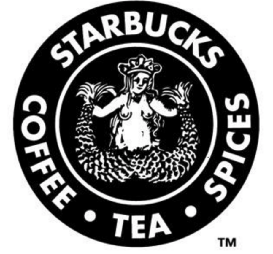
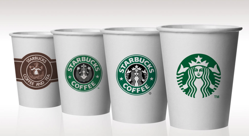
The evolution of the Starbucks logo is an interesting one, they originally began searching for a logo in 1971 and wanted to grasp the traditions of seafaring amongst early coffee traders. They researched many old books on the topic of marine exploration and came across a sixteenth-century Norse woodcut of a two-tailed mermaid that was circled by the company’s original name, Starbucks Coffee, Tea, and Spice. You can see the original design below.
The mysterious woman is simply referred to as “The Siren” and has always been included in their logo, even as they moved away from the original design and went through years of redesign. “The Siren” is now a staple of Starbucks’ brand and the image below works to demonstrate how their logo has evolved over the years.
3. Domino’s
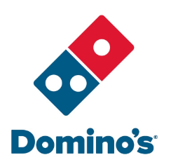
Where would the world be without pizza? Let alone pizza delivery. That’s why we had to include Domino’s as one of the most well-recognized restaurant logos out there. They’re currently in 85 different countries and are steadily growing by constantly whipping up new recipes for success.
Domino’s was started in a small town in Michigan during the 1960’s and has a logo with distinctive bright red and blue that stands out and grabs people’s attention, but they also experienced many changes to their logo over the years.
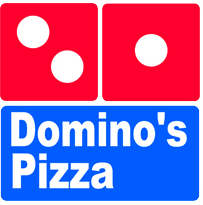
The logo above was the original logo made in the 1960s and had two major characteristics, bright colors that are really noticeable to attract more customers and three dots to symbolize the three locations that were open at the time. For a moment, Domino’s planned on adding a dot for each new location they opened up, but as you could imagine, fitting over 5,000 dots in a square can get pretty difficult.
4. Pizza Hut
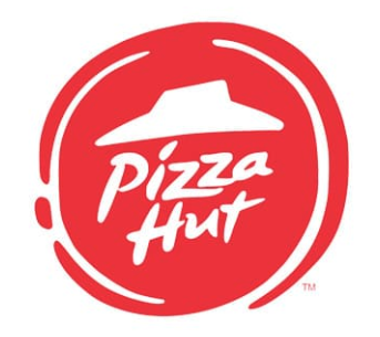
We can’t talk about well-recognized brands without bringing up the chain famous for the red roof. Pizza Hut is one of the most dominant restaurants out there and their logo can be seen all over the world.
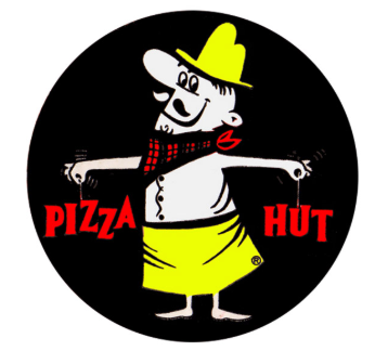
Their first logo came along in 1955 and features their mascot, Pete, holding the words “Pizza” and “Hut”, as seen above.
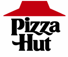
It wasn’t until 1968 that Pizza Hut began using a more simplified logo with their famous red roof design. Pizza Hut then went on to have a number of different design changes before landing on their current design that they began using in 2014.
5. Subway
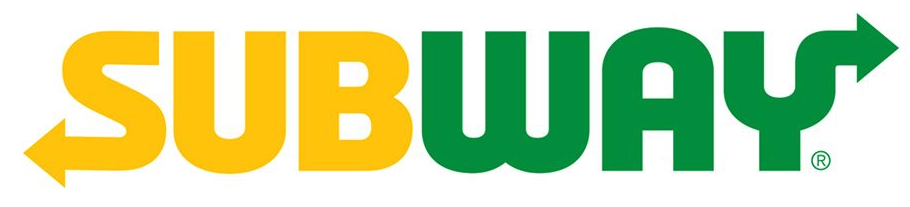
It’s no surprise that the restaurant with the most locations found throughout the world would also have one of the most well-recognized logos amongst restaurants. Built on the foundation of offering their customers fresh food in a fast, convenient way, SubWay has grown to explode in popularity.
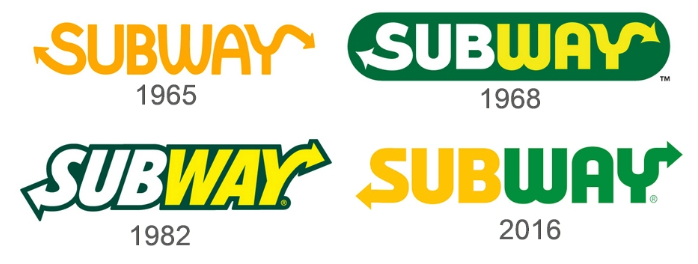
As you can see in the above images, there hasn’t been any substantial changes in Subway’s design over the years. The bottom of the “S” contains an arrow while the top of the “Y” also contains an arrow. These arrows have been kept to show that SubWay still prides themselves on providing fast service. Their most recent restaurant logo, which started being used in 2016, was very similar to their initial logo that was created in 1965 and signaled a departure to the restaurant logo that was in use from 1982.
6. Burger King
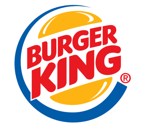
Burger King is also included on this list thanks to their signature flame-grilled style and preparing each burger to order each and every time. Similar to many other fast food restaurant logos like McDonald’s, Burger King uses a lot of red & yellow.
This isn’t a coincidence, it’s actually a psychological strategy, the color red triggers stimulation, appetite, hunger, and it attracts attention. The color yellow triggers feelings of happiness and friendliness. When you put them together, they signal speed & quickness, they let everyone know that you can get your food quickly and that you’ll enjoy it. Yellow is also the most visible color in daylight, which is why the McDonald’s arches logo can be seen so far away.
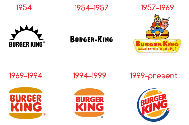
When examining the history of Burger King, you’ll see that the very first logos made in 1954 were very plain and the only colors used were black & white. It wasn’t until 1957 that they introduced color as part of their design, as well as a small mascot they eventually did away with in 1969, where they chose to move to a simpler look. The logo was then slightly changed in 1994 with different colors as well as more compact shapes for the buns and letters inside. It wasn’t until 1999 that the present day logo was created that brought in a blue swoosh symbol that went around the left side of the logo.
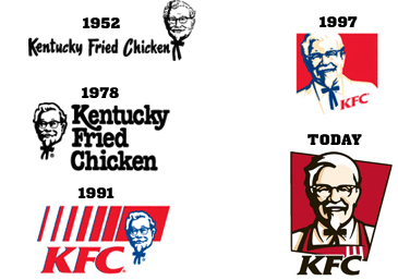
7. KFC
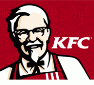
The fried chicken giant makes it onto the list as their famous mascot, Colonel Sanders, graces their logo with a wide grin. Their logo has experienced a number of changes since its inception in 1952 but has always made sure to include Colonel Sanders.
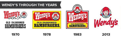
8. Wendy’s
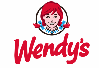
The burger chain restaurant founded by Dave Thomas in 1969 features their mascot, Wendy, and has gone through a number of changes throughout the years. Their original designs in the 70s and 80s featured designs with many details and colors included, their current design made in 2013 features a more modern feel, along with a simplistic look.
9. Taco Bell
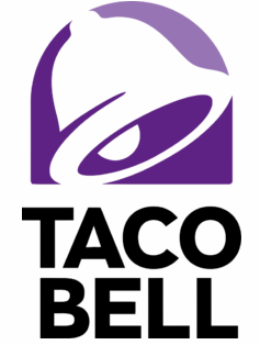
Based out of Irvine, California, Taco Bell offers a variety of Tex-Mex style foods that includes tacos, burritos, quesadillas, nachos, as well as many other items. The logo has gone through many changes throughout its history with varying styles and colors used.

The logo shown above, used between 1969-1972, uses an interesting block letter design that many people likely wouldn’t associate with Taco Bell at first glance. It was quickly deemed outdated after being the logo for only a few years.
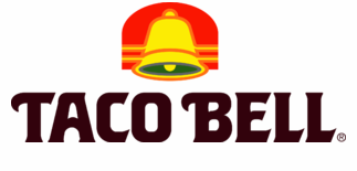
This logo was used between 1985-1994 and shows how they adopted a more modern design along with incorporating the bell that is commonly associated with their brand today.

The following logo shown above displays how they began to move towards a cleaner look as well as incorporating the color purple that is still seen in their logo today. This cleaner look was used between 1994-2016.
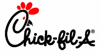
10. Chick-fil-a
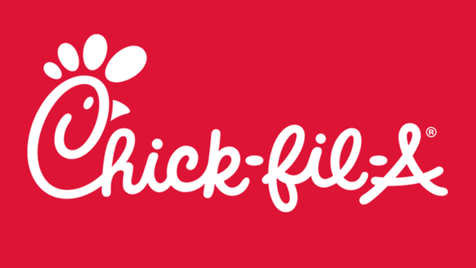
Chick-fil-a has been voted America’s favorite fast-food restaurant and is well on it’s way to world domination. That said, their history of logos are just as interesting and contains a number of variations.

This logo was used from 1967-1970 and shows a fully drawn chicken head separate from the lettering. Chick-fil-a was very much a regional restaurant at this point and thoughts of adopting a more mainstream logo design weren’t considered until much later.
Then in 1970, they began using a logo that had the chicken head drawn into the first “C” of Chick-fil-a. This marked a special time in the history of their logos as they chose to get rid of the chicken head illustration to, instead, incorporate it into their lettering. Aside from changing the color, this version was kept in use up to the present day.
11. Arby’s
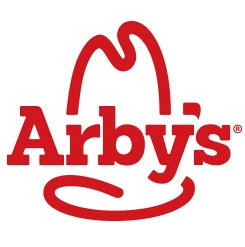
The sandwich chain known for slow roasted beef, turkey, and premium Angus comes in at number eleven with their logo that contains a cowboy hat placed around the name of the company. The hat helps give the restaurant a cowboy flair but the logo didn’t always look like that.
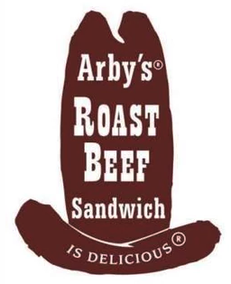
Back in 1964, their logo had a much darker shade of red and had more words that helped described what Arby’s was about. Although it was effective at first, as time went on, they wanted to steer towards a cleaner look.
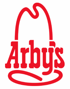
From 1969 up until 2012, Arby’s stuck with this more updated look that has laid the foundation for their logos up until present day. Although it was eventually changed, this modern look proved to be a major part of Arby’s identify and helped craft the company into what it is today.
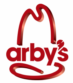
After using the same logo for many years, in 2012, Arby’s chose to go with a logo that would signal a departure from the very straightforward designs that Arby’s used throughout their history. This new look used a 3D design that tried its best to be more modern, but it proved to be too much of a departure from their western theme and Arby’s ultimately chose to make the change to their present-day theme in 2013.
12. Dunkin’ Donuts
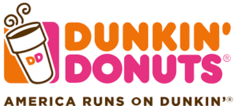
The brand made famous for getting people their morning cup of coffee has been a large part of American society for years now, and their logo ensures that everyone is aware of that by directly writing “America Runs on Dunkin” across the bottom of the image. As well as a cup of coffee that helps to position their brand as the best way to start a person’s day.
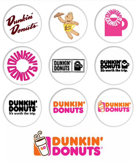
But the logo hasn’t always looked like that, in fact, it has gone through a lot of very major changes throughout their years to get to where it is now. If you examine the image below, you’ll see that they’ve tried out a number of logos throughout their 68 years of existence. As well as a mascot that was used in the 50’s named Dunkie.
Conclusion
Although you may see a logo as just another image on your bag of food whenever you leave a restaurant, it’s important to understand that there’s a long history behind how these symbols came to be and that they have evolved to be some of the most well-recognized images on the planet. You could go across the world to a country where the people don’t look like you, don’t speak your language, have completely different customs, but you would both recognize a McDonald’s when you see one.
Which is pretty eye-opening when you really think about it.
What else is eye-opening is knowing that there are restaurants out there trying to make it onto this list while still using inept ways to schedule their employees and build their shifts. The above brands got to where they are because of the people they had around them, not because off of one person’s efforts. Make sure to click on the button below to find out how Deputy will help strengthen your restaurant’s workforce.

